System Design
Self-Service
Authentication Banner System Design
A scalable authentication entry system that standardized access patterns across 1,000+ pages.
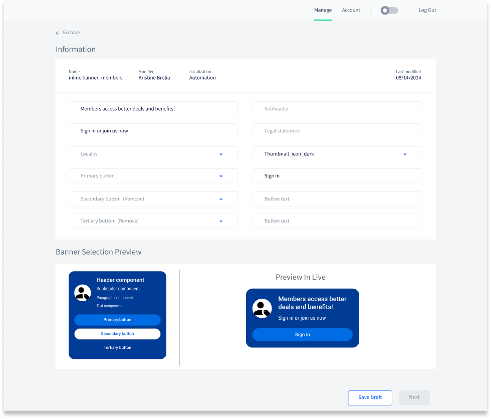
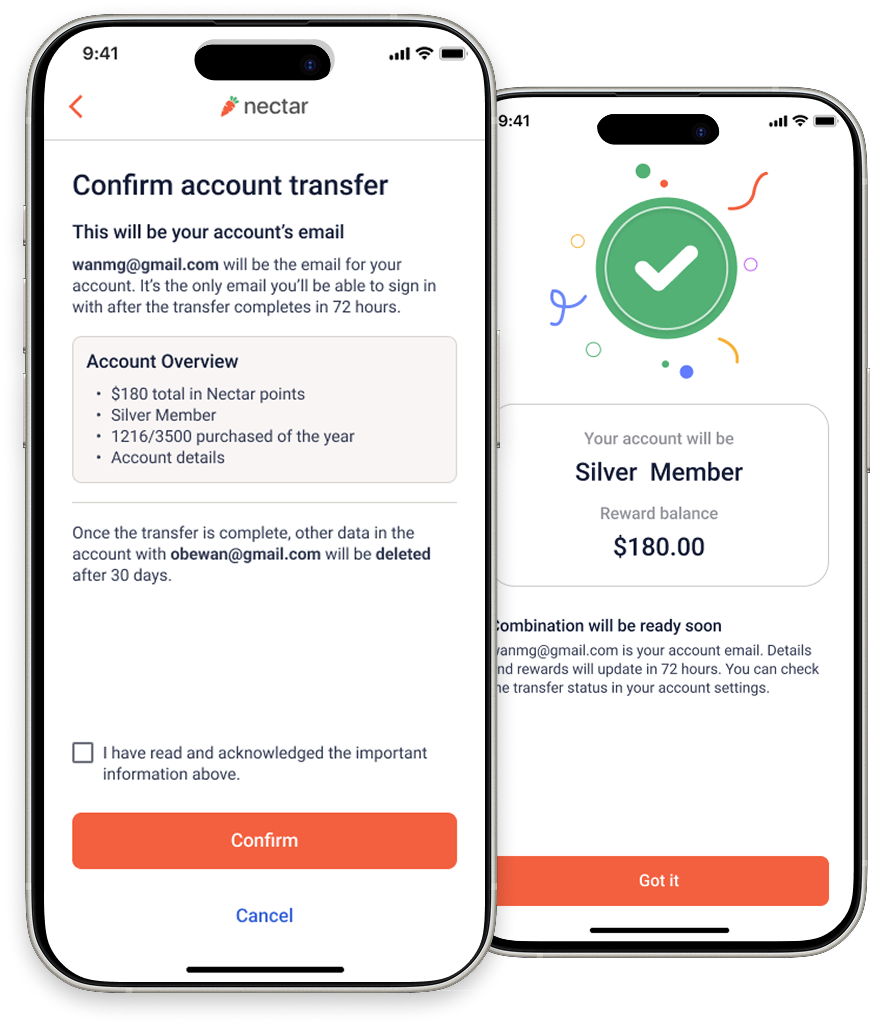
Illustrative example only. Not a final or production UI.
Impact:
- Localization runtime: 120h → 3h
- Design-to-dev cycle: 4 weeks → 1 week
- Same-day publishing via CMS
- Zero engineering support for routine updates
Role: UX Designer (Platform / Authentication)
Timeline: 3 Weeks
Teams: Engineering, Product, Design, Market, Legal (over 15+ stakeholders)
Timeline: 3 Weeks
Teams: Engineering, Product, Design, Market, Legal (over 15+ stakeholders)
What is this?
Context
This banner design serves as a foundational entry point for authentication on all page types, defining how sign-in and account creation are safely and consistently initiated across1,000+ pages.
Why does it matter?
The Problem
Frequent banner updates caused recurring engineering work, inconsistent designs across teams, longlocalization cycles, and delayed delivery. Resources couldn't allocate to higher-impact initiatives.
How was it solved?
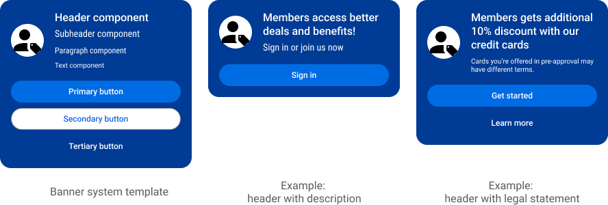
Solution
Designed a CMS-powered banner template that balances flexibility with governance, maintains design consistency, and enables non-technical teams to publish updates without additional tech support.
What changed?
Impact
Significantly reduced engineering workload and the runtime of localization from ~120 hours (5 days) to 3 hours per update, standardized experience, enabled self-serve publishing by product teams.
My role in this case
- Led the end-to-end design of a scalable authentication system, driving alignment across engineering, product, and legal stakeholders to resolve technical constraints and delivery risk.
- Aligned cross-functional teams to reduce operational risk, standardize access patterns, and improve delivery efficiency.
Decision Process
Understanding the Real Pain Points
Why are we solving this?
A "simple banner update" sounds simple, but it s actually a recurring organizational bottleneck in reality.
- Every quarterly update triggered new engineering work.
- Different design teams submitted different design files, resulting in inconsistent layouts across page types.
- Localization alone required ~5 days (120 hours) per iteration on text, thus small content changes often restarted the entire delivery cycle.
As a result, engineering capacity was repeatedly consumed by low-leverage work, delaying higher-impact initiatives and increasing internal business operational cost.
Business Evaluation & Product Requirements
How to define a scalable banner model?
To solve the problem at scale, the solution had to support:
- Integrate with Experience Manager (CMS), so non-technical teams could publish independently.
- Maintain design consistency across diverse page types (home, search, product, checkout, etc.)
- Support requirements for legal, variable experience patterns, accessibility, localization, and edge cases to prevent layout breakage across devices.
- Model design needs to be approved by 15+ stakeholders across 10 teams, each with distinct design principles.
This shifted the problem from “designing a banner” to designing a system that could survive organizational and technical complexity.
Design Strategy & Explorations
How I approached a complex system problem?
Instead of starting with visuals, I focused on:
- Identifying repeatable patterns
- Defining guardrails instead of fixed layouts
- Designing not just for the ideal scenario, but also for edge cases.
- Create multiple design explorations to stress-test the system including product and design requirements before finalizing design proposal.
The guiding principle was:
If the system works for the worst-case scenario, it will scale effortlessly for everything else.
If the system works for the worst-case scenario, it will scale effortlessly for everything else.
Design × Technology Trade-offs
Navigating constraints, not fighting them
Several proposed designs were not technically feasible due to CMS platform limitations.
Rather than treating this as a blocker, I worked closely with the engineers to:
Rather than treating this as a blocker, I worked closely with the engineers to:
- Understand technical constraints early
- Evaluate alternative design approaches
- Make informed trade-offs that preserved usability and scalability
The final solution represents a balanced outcome, where design intent and technical reality reinforced each other.
Solution Highlights
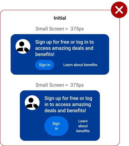
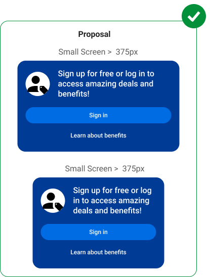
Layout Resilience for Variable Content
Improved layout resilience by restructuring CTA placement to prevent wrapping and maintain usability across smaller screens, longer localized content, and accessibility settings.
This ensured:
This ensured:
- Visual stability across devices even with localization
- Improved touch targets on small devices
- Preserved trust by avoiding broken UI states
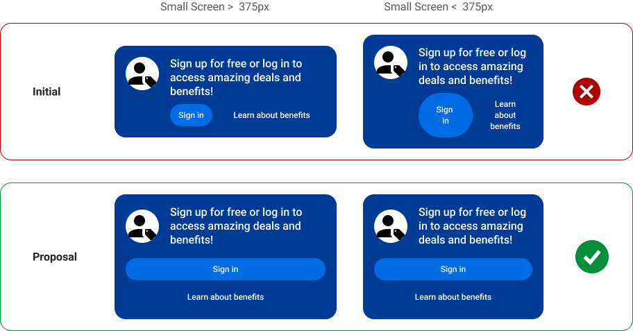
Illustrative example only. Not a final or production UI.
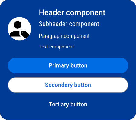
Governed Flexibility for Authentication Entry
Enabled governed flexibility by defining configurable banner layouts that support diverse use cases while preserving consistency, accessibility, and compliance.
This eliminated the need for custom engineering work while maintaining consistency and flexibility.
This eliminated the need for custom engineering work while maintaining consistency and flexibility.


Illustrative example only. Not a final or production UI.